|

THIS WEEK: Spring Training Teams
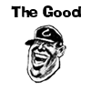
 THE GOOD: The Minnesota Twins THE GOOD: The Minnesota Twins
For friendly, you can't beat the Twins logo: two pals, St. Paul and Minneapolis, shaking hands across the mighty Mississippi, drawn with all the ballooney flair of the Hamm's bear. On the hat, the red and white TC, signifying Twin Cities. Is there any logo so closely connected to its home? Of course, St. Paulites loathe Minneapolis, and Minneapolites act as if they stand alone, but it's still a good try.
 THE BAD: The Cleveland Indians THE BAD: The Cleveland Indians
The Jury's still out (and will be so forever) as to whether or not Native American mascots are disrespectful. While some suggest that the Braves are meant to be respectful, the little hook-nosed, grinning Chief Wahoo certainly isn't—it's was a disgusting stereotype from minute one—and only those who would waste their time with Michael Savage would think otherwise.
 THE UGLY: The Canadian Teams THE UGLY: The Canadian Teams
Weird indeed are the logos of the Toronto Blue Jays and Montreal Expos, though you have to give them credit for sticking with the tried and true (as opposed to the rest of the expansion teams, from the Brewers to the Angels). That futuristic Toronto Blue Jay and the space age lettering make it seem like we're catching a ballgame in "Sleeper". To look at their caps, you'd think it was always 1969 in Montreal. Despite the strange apparel, we have to admit that it's nice that at least some teams remain true to the spirit of the 70s.

|